Wednesday, March 20, 2013

Office for Administration - EXCEL

MS EXCEL

Excel is a spreadsheet programme which allows CALCULATIONS to be made. It is hugely useful for a variety of different applications in teaching, including the dreaded Mark Sheets which most teachers need to do at some stage or another.

However, that is not all Excel can be used for - here are a few other ideas for using them in the classroom:
Use the cells to design a SEATING PLAN of the kids in your class - and you can even use the REVIEW menu to add comments about what to look out for - "He talks too much" "She will burst into tears if you raise your Voice" etc.


Create a CLASS LIST. You can sort Alphabetically using the SORT tool - but don't forget to EXPAND THE SELECTION if you select only one column at the beginning


Draw Graphs or Charts to show data graphically. The Chart Icon allows you to turn your data into a chart. You can choose a variety of different types of graphs. You can even make PICTOGRAPHS

Make a MARK BOOK

You have detailed instructions on how to create a Mark Book. Some of the skills you will need to master are:

  • Renaming the Spreadsheet
  • Sorting class lists alphabetically
  • Orientating Headings
  • Calculating the SUM of a range of numbers
  • Calculating the AVERAGE of a range of numbers
  • Changing data
  • Saving and retrieving the markbook

Remember when you perform a calculation that there are some rules that you need to follow

eg

Tuesday, March 19, 2013

Office for Administration - Word

The Microsoft Office - and other shareware Office packages - are "lifesavers" for teachers to use. They give you an opportunity not only to make your Admin work neat, but also to re-use them in other terms and years. The best part, is that you can make changes on a regular basis.

Here is a list of some of the things you can use WORD for

  • Creating worksheets
  • Setting test and exam papers
  • Developing assessment rubrics
  • Writing good news or disciplinary notes
  • Weekly lesson plan
  • Creating certificates
  • Designing concert programme
  • Publishing sport team lists
  • Writing letters to parents or sponsors
  • Drawing diagrams using lines and shapes
  • Creating newsletters
  • Writing and editing essays / reports
  • Completing learner support templates
  • Writing CVs

We will look at a few of these applications in this course.

WORKSHEETS

Use text boxes, tables and call outs to make the worksheet interesting.

Make sure that the text is large enough to read.

A clear, clean font makes the worksheet easier to read – even for senior grades


Tests and Exams

Remember when you are testing learners, the test should be on the content they have learnt and the skills they use in applying the content NOT their ability to read a poorly designed test with untidy and difficult to read writing and confusing questions.
 
Make sure the SPACING between lines is at least 1.5 - this makes scanning and close reading easier.
 
Use a reasonable font size - a minimum of 12, and up to 16 for younger learners.  I generally use Calibri 14 as this is easy to read.
 
The Layout of the test can help learners follow instructions.
 
Tick boxes are useful for True/False questions
 
  • Use Google Forms (find them on Google Drive) OR make your own tick boxes using INSERT - SHAPES
 
 
 Numbers for multiple choice questions can be inserted from the HOME menu
 
Lines for writing extended answers are important if learners are to work on the question paper - don't just leave a space
 
Tables with blocks to fill in are really useful if only a small amount of text is wanted. 

Assessment Rubrics
 
Tables
These make it really easy to see what is going on. You can insert a table from the INSERT menu - select how many columns and rows you need.


Merge Cells
This allows you to make clear headings for sections of the rubric, or it allows you to make a clear line between sections
Highlight the cells you want to merge and MERGE CELLS

You can also SPLIT a cell into more lines or columns

Borders and Shading
This makes assessment sheets clear and easy to follow.
Use the Borders and Shading tool to make clear divisions between types of information in the rubric


Smiley Faces or other graphics
In the Foundation Phase you may want to use "smiley faces" to help the learners understand what you are looking for.
One place you can find a smily face icon is in the BASIC SHAPES menu in the INSERT toolbar.
You can even change the shape of the mouth by "pulling" on the diamond on the mouth
Certificates

Templates are useful here

Use Office on line - the best ones are definitely on line

Make your own and save it as a template so you can use it again


Newsletters

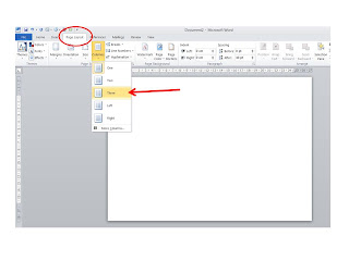
Columns make newsletters easier to read - find these in the PAGE LAYOUT menu

Use text boxes to emphasise points

Insert graphics - remember to use the TEXT WRAP - THROUGH tool so your pictures don't move your text around


CVs


Use the Templates Menu or make your own
It is called RESUME in the American programmes


Choose the type and style you need
Don’t put pictures, fancy fonts, etc onto them
A cover page is not essential but can make it look tidy

Notes and letters

A useful tool is a MAIL MERGE

Put people’s names on the top of each letter

Find this in MAILINGS

Start Mail Merge

Select Recipients

Make your own data base of names
Merge and Finish to print individualised letters


Blog Notifications


HOW TO GET RID OF ALL THE ANNOYING NOTIFICATIONS IN YOUR BOX ACCOUNT.

Saturday, March 16, 2013

Assignments for this term

Posters:


These should all have been completed and sent to me by now.

I will reply to you as soon as possible and make comments and suggestions.

Presentations:

These must be EITHER

A Powerpoint that you can use to teach your Specific Skills lesson

It should be a minimum of 6 -8 slides and should contain elements - pictures, text, Smart Art - that will ENGAGE and CHALLENGE your learners.
Use the information I gave in the lecture about backgrounds and animations.
A plain white powerpoint containing no pictures or animations will gain minimum marks.

If you did not attend the lecture, that will not be an excuse for sub-standard work.

OR

A Prezi that you will use to teach your Specific Skills lesson

There is no fixed number of elements or positions, but it should be something that can ENGAGE AND CHALLENGE.

The addition of extra elements will always gain more marks.

Due Dates:

Group A and B - 18 March

Group C and D - 26 March

Please don't expect a reply by return mail - there are 100 of you!  I will be in New Zealand from 22 March to 5 May but will check e-mail most days and will reply before you have to do your presentation.

How to use box.com

You should have received an invitation to collaborate on a folder called Assignment 2


Please click to accept the invitation.
You may be asked to LOG IN
 
Box.com already knows your e-mail address as I sent you invitation to it.  But when you type in a password, you will get an error message saying your details are invalid.
 
This is because, as with all web based applications, you need to SIGN UP before you can LOG IN
 
Once you have SIGNED UP, you can LOG IN and access the folder.  You will never need to sign up again on that e-mail address, even if you want to create your own box.
 

UPLOADING A FILE

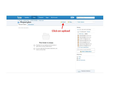
In the ASSIGNMENT 2 folder, click on UPLOAD and then save your presentation.  Please remember to name it with your NAME and STUDENT NUMBER so I know who to assign the marks to.


Sunday, March 3, 2013

Use Prezi to teach

What is Prezi? Prezi is a presentation tool that helps you organize and share your ideas.

Prezi is a cloud-based presentation software and storytelling tool for exploring and sharing ideas on
a virtual canvas. Prezi is distinguished by its Zooming User Interface (ZUI), which enables users to
zoom in and out of their presentation media. (Wikipedia)

How is Prezi different from Powerpoint?

  • Powerpoint is a series of sequential slides
  • Prezi is a series of objects – text, pictures, videos, shapes, arrows, etc – which are “visited” in a prescribed path.

The Prezi Software

Prezi is available free in a web based version

That means that you have to work online while you create the Prezi

However, you can save it for off-line use – so you can present it even when there is no internet

A desktop (offline) version is available

You have to pay to use it

However, you can download a 30 day free version

Find the software here: Prezi download

 
How to make a Prezi

You have two options

Blank Preziadd all your own elements

Template – use a pre-made template and add your own information


Start a Blank Prezi

The Prezi screen is like a big storyboard or canvas.  It is marked off in squares which help you position any pictures, but these squares are just markers and will not appear in the final presentation.

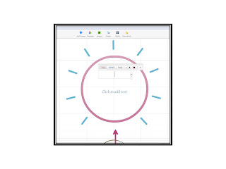
There is a big circle frame in the middle of your page.

If you want to use it, work with it.

If you prefer a blank canvas, delete the frame altogether and start from scratch or delete just the frame.


1. Plan Content

Plan exactly what you want to say and what pictures you want to use but don’t worry too much about the design – you can change that later

2. Add a frame:

You don’t have to have a frame to type in, but it looks good and holds the text together visually.

If you click, you will automatically get a blank frame.

You can choose what shape frame you want by selecting the shape in the box and clicking and dragging.
 

3. Add text

Type it in – either in your frame or anywhere on the board - it doesn’t matter where or what size it is

Click anywhere on the board and start typing when the text box opens


4. Edit your text:

You can choose whether you want:  Heading, sub-heading or body text.  You can also change the size or alignment but not the font.


5. Add Images

Click on the IMAGES icon at the top of the screen

You will be able to choose if you want to add a picture you have already saved, or if you want to look for a Google image.

Whichever option you choose, the picture will be inserted in your workspace.  You can then crop, delete, move or resize the picture.


6. Add Shapes

This button allows you to add shapes which you can write in, arrows to link one frame with another or a pencil which allows you to draw.


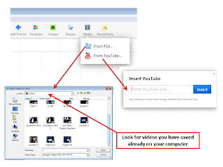
7. Add Media

Although this button says you can add Audio, it only looks for video files.

You can insert a link to a Youtube video (if you are sure the person playing it will be online) or you can save the video and embed it in the presentation.


EDIT YOUR WORKSPACE

1. Navigate your way around the workspace

Point your cursor at the right hand side of your screen and you will find the navigation buttons.

Home will take you back to the place you started working

+ will make the objects appear bigger and will make them appear smaller ie you will zoom in or out of the screen

You can also do this with the roller on your mouse.

 
2. The Transformation Tool

 
Once you add anything to your canvas, click on it once to bring up the Transformation Tool. Now you can move, size, and rotate your content anyway you like. If you add a frame to your prezi, you can click on it once to bring up the Transformation Tool and move, scale, or rotate everything inside.


3. The Overall Storyboard or Canvas

Use the Theme Wizard to customize the colors of your prezi and to set your font choices from Prezi's font library.


4. Tidy your canvas

When you start your Prezi you usually start with the “big picture” so you need to start organising the different elements so that they will make sense.

Place text and pictures where you want them and make sure they make a pleasing “picture”

Click on the different objects you have inserted and drag them to wherever you want them.

Related text and pictures are probably better next to each other.

5. “Hide” some of the text

Your body text can be made very small so that it is not obvious in the “big picture”. Once you add the motion path, the text will zoom to full size.  This adds an element of surprise to your presentation.

 6. Create a motion path

When presenting your ideas, it helps to have a clear narrative that takes your audience through your prezi. You can create a journey from one idea to the next.

Edit your path and its points in Edit mode and take your audience along that path in Present mode.

When all your objects are in the right places, click on EDIT PATH

You can now click on the objects in your Prezi canvas in the order that you want them to appear.

Thumbnails of each element will appear on the left of the screen.

You can also use the Edit Path sidebar to add new path points and to rearrange and delete path points or to zoom to a specific path point.


7. Change the order on the Path

You can add an extra place on the path by clicking on the + between two points and dragging it to a new object.

Prezi will automatically re-order the path.


8. Present your Prezi

Click on the PRESENT button at the top and then start your Prezi.

Use the navigation buttons on the bottom to move forwards or backwards along your path.

Click on the HOME button over on the left before you start to make sure your “Big Picture” is properly centered.


Create a Prezi from a Template

This is DEAD EASY!

  • From the Open Screen select the template you think will fit your idea
  • Select CHOOSE once you have found one you like
 

The programme has done everything for you
  • Insert your text into the frames
  • Motion Paths have been inserted
  • If you want to add other elements, use the tools at the top
  • Save the Prezi with you own name
  • Present it!