Here is a list of some of the things you can use WORD for
- Creating worksheets
- Setting test and exam papers
- Developing assessment rubrics
- Writing good news or disciplinary notes
- Weekly lesson plan
- Creating certificates
- Designing concert programme
- Publishing sport team lists
- Writing letters to parents or sponsors
- Drawing diagrams using lines and shapes
- Creating newsletters
- Writing and editing essays / reports
- Completing learner support templates
- Writing CVs
We
will look at a few of these applications in this course.
WORKSHEETS
Use
text boxes, tables and call outs to make the worksheet
interesting.
Make
sure that the text is large enough to read.
A
clear, clean font makes the worksheet easier to read – even for senior
grades
Tests and Exams
Remember when you are testing learners, the test should be on the content they have learnt and the skills they use in applying the content NOT their ability to read a poorly designed test with untidy and difficult to read writing and confusing questions.
Make sure the SPACING between lines is at least 1.5 - this makes scanning and close reading easier.
Use a reasonable font size - a minimum of 12, and up to 16 for younger learners. I generally use Calibri 14 as this is easy to read.
The Layout of the test can help learners follow instructions.
Tick
boxes are useful for True/False questions
- Use Google Forms (find them on Google Drive) OR make your own tick boxes using INSERT - SHAPES
Numbers for multiple choice questions can be inserted from the HOME menu
Lines for writing extended answers are important if learners are to work on the question paper - don't just leave a space
Tables with blocks to fill in are really useful if only a small amount of text is wanted.
Assessment Rubrics
Tables
These make it really easy to see what is going on. You can insert a table from the INSERT menu - select how many columns and rows you need.
These make it really easy to see what is going on. You can insert a table from the INSERT menu - select how many columns and rows you need.

Merge
Cells
This
allows you to make clear headings for sections of the rubric, or it allows you
to make a clear line between sections
Highlight
the cells you want to merge and MERGE CELLS
You can also SPLIT a cell into more lines or columns
Borders and Shading
You can also SPLIT a cell into more lines or columns
Borders and Shading
This
makes assessment sheets clear and easy to follow.
Smiley
Faces or other graphics
In
the Foundation Phase you may want to use "smiley faces" to help the learners
understand what you are looking for.
One
place you can find a smily face icon is in the BASIC SHAPES menu in the INSERT
toolbar.
You
can even change the shape of the mouth by "pulling" on the diamond on the
mouth
Certificates
Templates
are useful here
Use Office
on line - the best ones are definitely on line
Make
your own and save it as a template so you can use it again
Newsletters
Columns
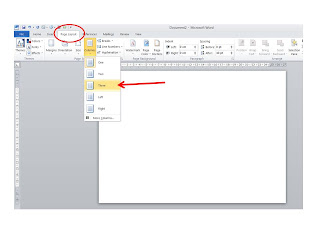
make newsletters easier to read - find these in the PAGE LAYOUT
menu
Use
text boxes to emphasise points
Insert
graphics - remember to use the TEXT WRAP - THROUGH tool so your pictures don't
move your text around
CVs
Use
the Templates Menu or make your own
Don’t
put pictures, fancy fonts, etc
onto them
A
cover page is not essential but can make it look tidy
Notes and letters
A
useful tool is a MAIL MERGE
Put
people’s names on the top of each letter
Find
this in MAILINGS
Start
Mail Merge
Select
Recipients
Make
your own data base of names
Merge
and Finish to print individualised letters


No comments:
Post a Comment